Driving whilst concentrating on the rear view mirror
No point betting after the race is run…
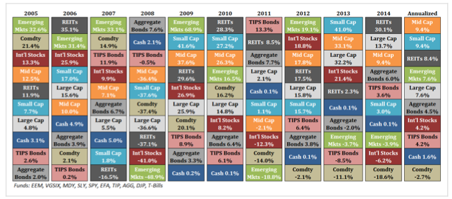
A graphic that gets looked at quite a bit in the investment world is sometimes referred to as the “asset allocation quilt” – obviously because it looks like a quilt.

To make sense of this all you have to know is that each different asset class is given a colour, and then ranked year by year from best performer at the top down to worst performer at the bottom. The fact that this map of asset class returns looks like a quilted bedspread tells us everything we need to know about chasing last years best performer: Don’t.
It is like trying to bet on a horse after the race has been run….
What we can learn from this sort of analysis (without even having to look at the numbers in detail) is two things:
- it is virtually impossible to pick the winning investment asset class in any particular year
- it is almost always a bad bet chasing last years high flyer
With this knowledge in mind the strategy of building a diversified portfolio with a stronger emphasis upon getting the balance of asset classes right (after taking into account your own preferred level of risk and the investing timeframe you are working with) becomes the safer path to good returns.
It is a lot better chance of being a winner than putting it on the horse that has already run its race.
- Last updated on .